Back to all work
Design Systems

A design system developers can build from.

A complete Figma design system and a matching coded component library, with live demos, documentation and tokens on every page — so what gets built is what was designed. Self-initiated and built solo at OptinMonster, with AI-assisted development.
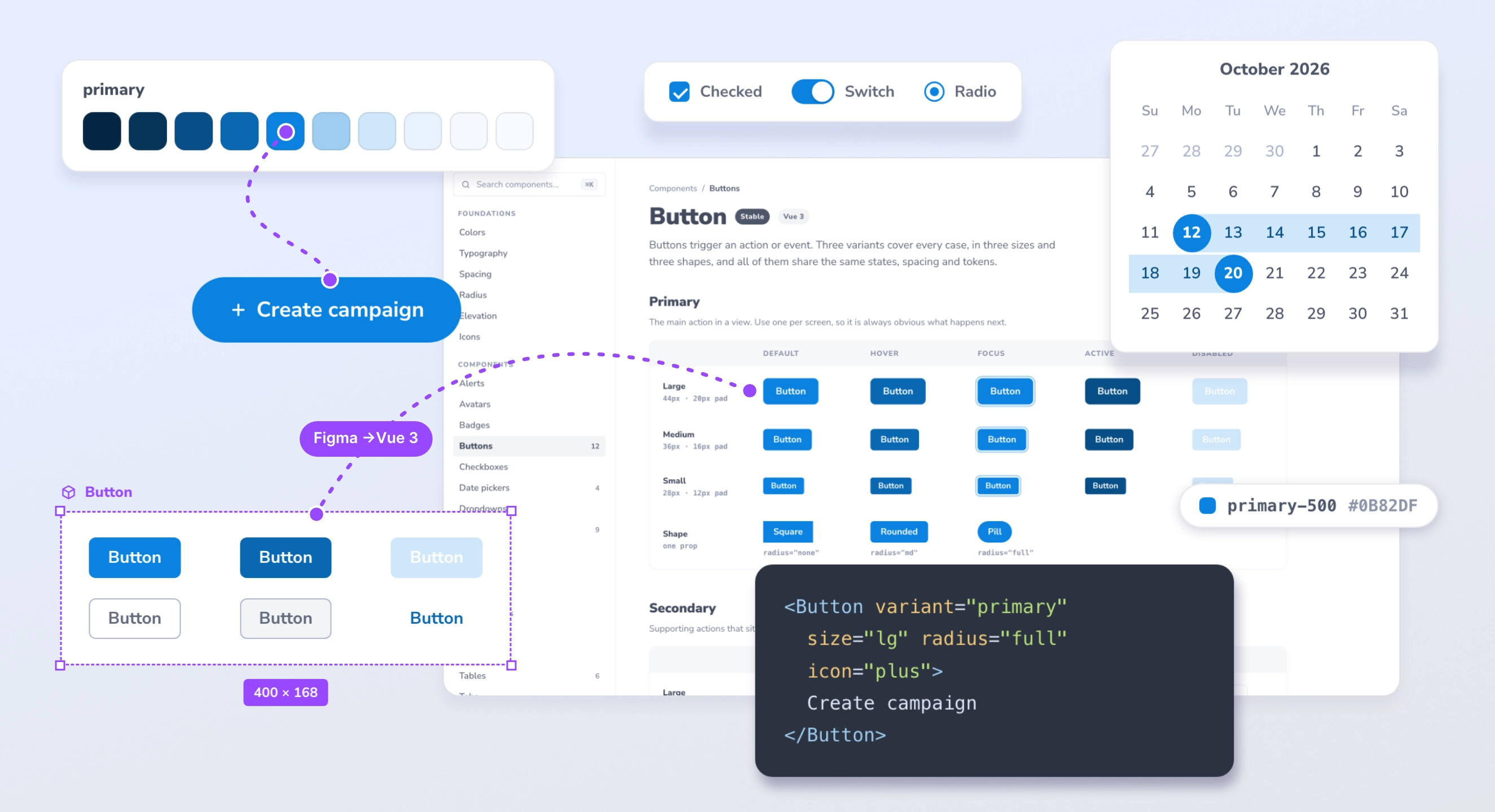
The design system as a composed scene: a primary color scale linked by a dotted purple line to a Create campaign button, then to a Figma-style Button component frame, and across to the same button in an angled Buttons documentation page, with the link labelled Figma to Vue 3. Around them float a checkbox, switch and radio card, a date range picker, a primary-500 token tag and a snippet of Vue code
Company OptinMonster (Awesome Motive)
Role Design Team Lead
Timeline Sep – Nov 2025
Scope Solo build · ~120 components
01

The problem

What was designed isn't always what gets built.

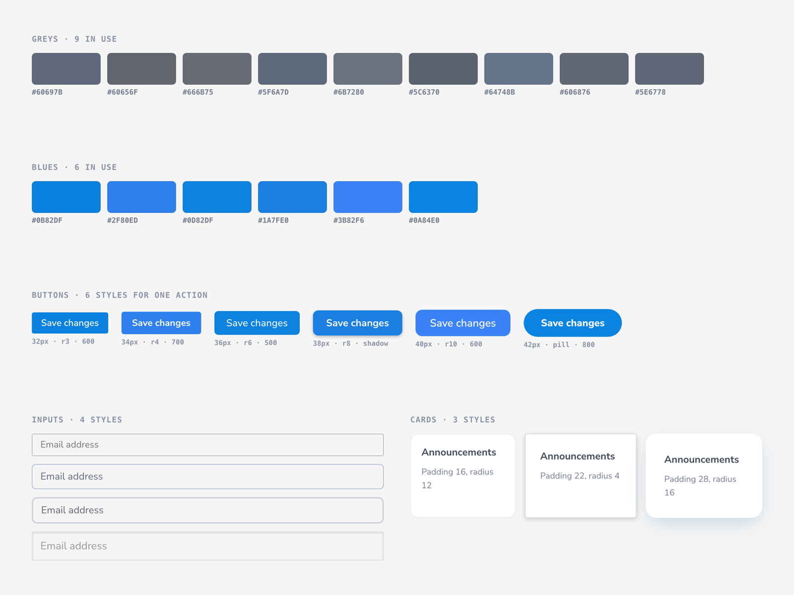
Designs handed over as Figma mockups were being interpreted, and interpretation drifts. Styling came out slightly off, components behaved differently from one screen to the next, and the gaps meant review rounds and corrections that ate time better spent moving projects forward. As the team's first designer, I'd watched it happen enough times to see the pattern: the problem wasn't effort, it was ambiguity. So I set out to remove it before development even started.

Style drift in practice: nine slightly different greys, six near-identical blues, six button styles for the same action with different heights, radii and weights, four input styles and three card styles
02

The system

A professional system, down to every state.

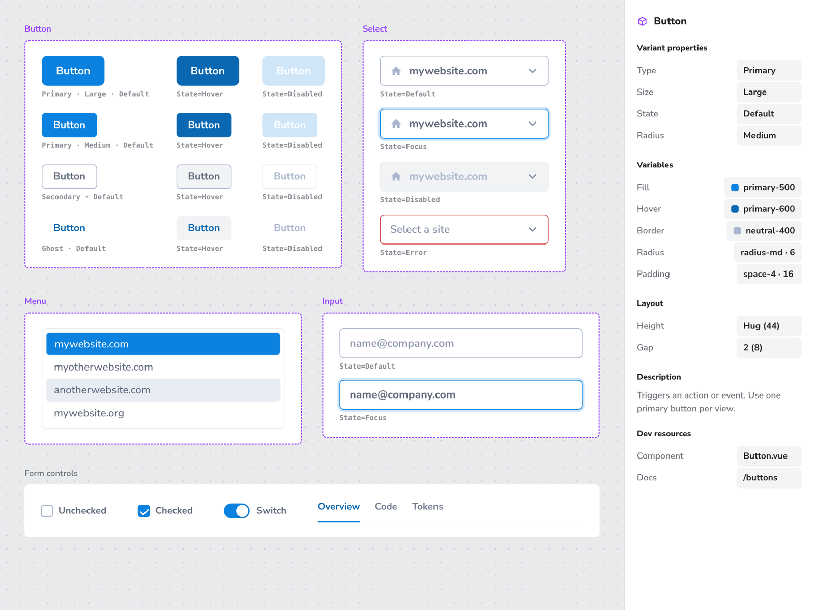
I structured it the way a commercially available system is structured, and built out everything a SaaS product runs on: buttons, inputs, selects and search boxes, single-date and range pickers, dropdowns, menus, tabs and more. Around 120 components in all, each with its variants, sizes and every interactive state, designed in Figma with the variables and tokens behind them, so nothing is left for anyone to guess.

A component sheet in a design tool: the Button component set with primary, secondary and ghost variants across default, hover and disabled states, a Select set, a Menu, Input states and form controls, with the variant properties and variables panel on the right
03

A key decision

Design it once. Ship the same thing.

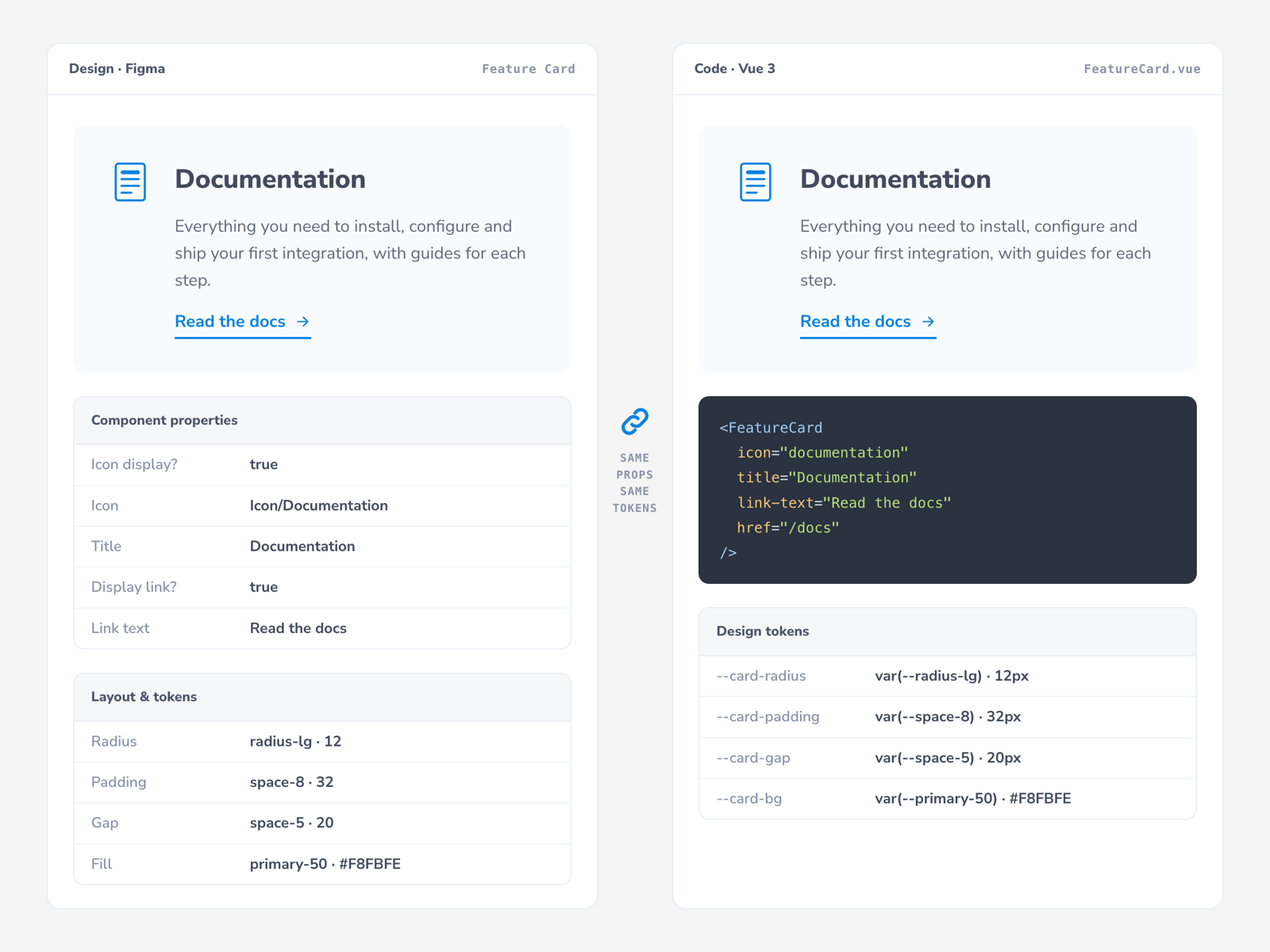
The key decision was to stop handing developers a picture and hand them the real thing. Every Figma component got a coded Vue 3 twin in a searchable, clearly organized library, where a developer could find a component, try it live, inspect its tokens and copy the code. I made the design and architecture decisions; AI-assisted development sped up the build. About three months, solo, for what would typically take a team of three around nine without AI — an estimate, but a fair one given the scope.

The same Feature Card shown twice, side by side: on the left as a Figma component with its properties, layout and tokens, on the right as its coded Vue 3 twin with the matching props and design tokens
04

The final result

Everything a developer needs, in one place.

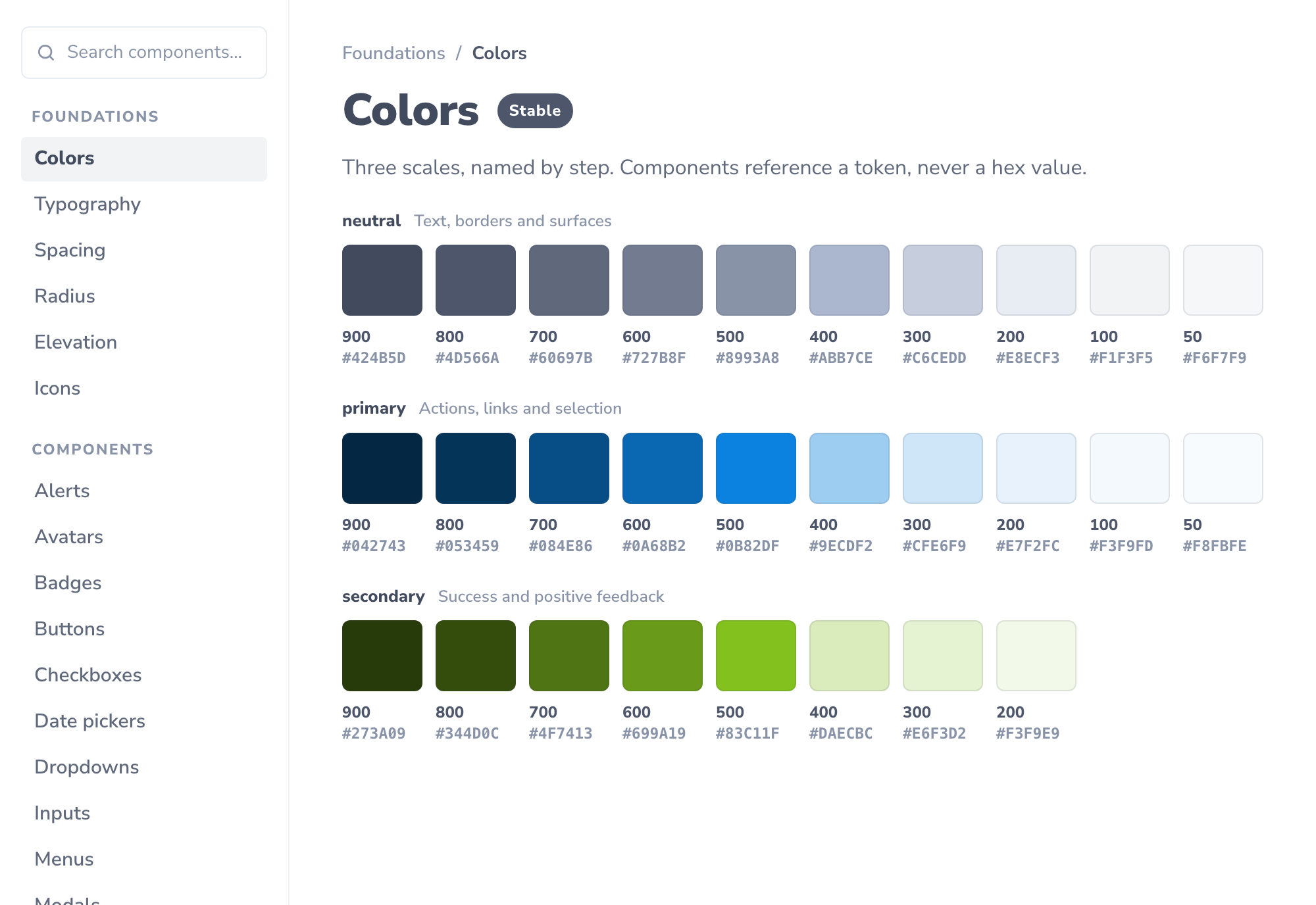
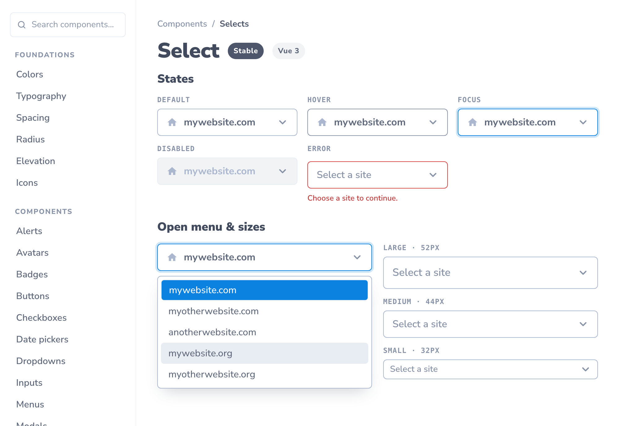
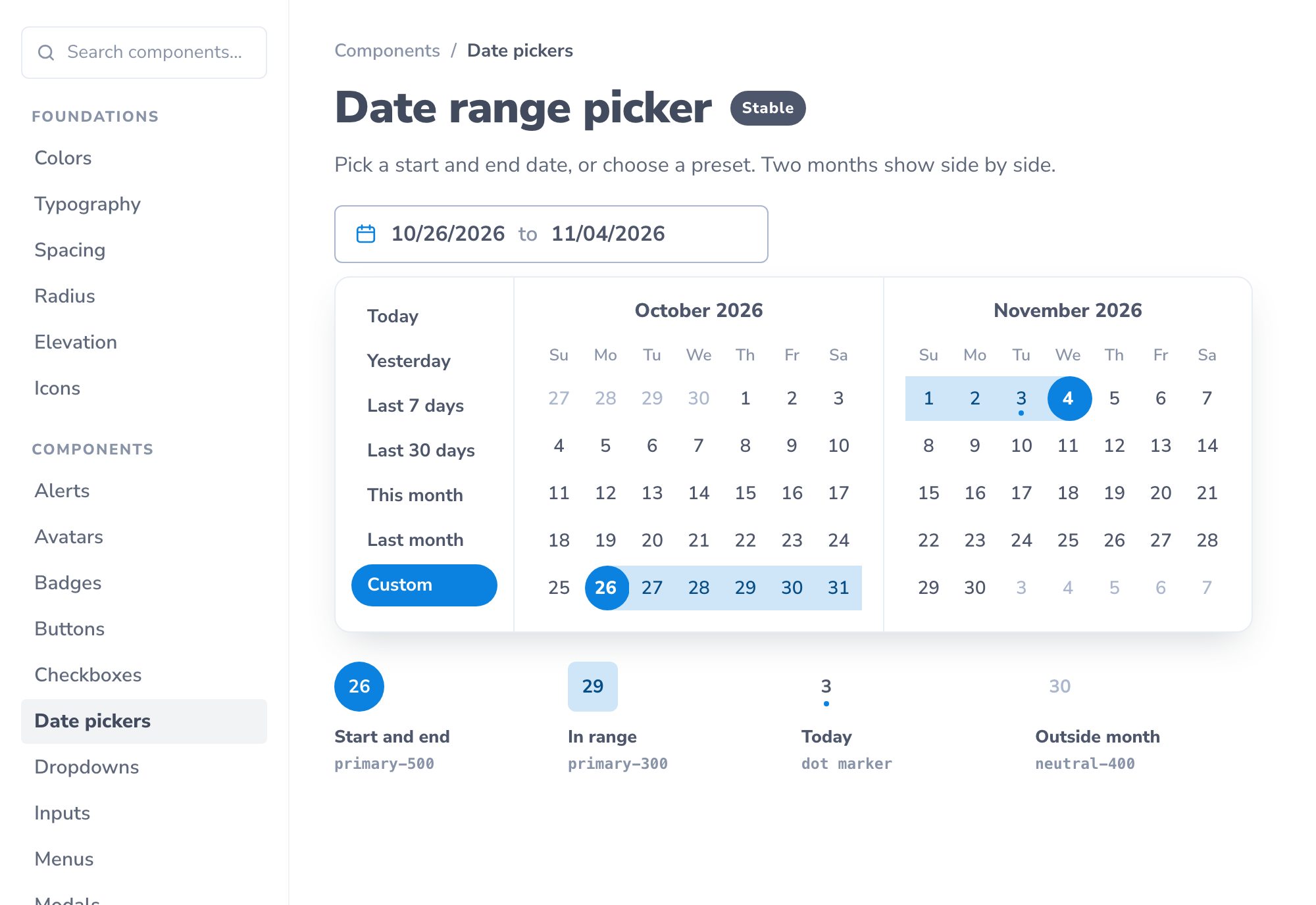
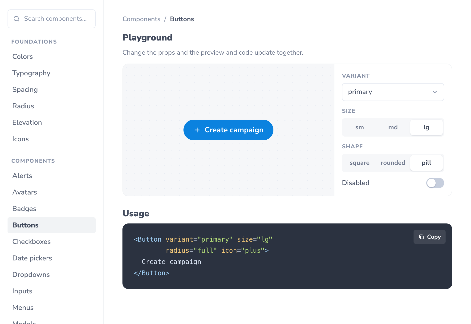
Three deliverables, working together: the Figma design system, the coded component library, and the documentation platform that ties them together. Each component has its own page, with its styles, sizes and states, interactive examples, props and tokens, usage docs and code ready to copy. A separate Playground goes further, letting developers change a component's properties and explore configurations beyond the examples. It was built to make implementation faster and more accurate, and to cut the design revisions and styling corrections that slow a team down.

The Colors documentation page: neutral, primary and secondary color scales, each step shown with its number and hex value The Select documentation page: default, hover, focus, disabled and error states, an open menu with a selected and a hovered option, and large, medium and small sizes The Date range picker documentation page: an input showing a chosen range, the open two-month calendar with presets and a selected range, and a legend for the start, end, in-range, today and outside-month states The Playground for the Button: a live preview with controls for variant, size, shape and disabled, above copy-and-paste Vue code
Next project

FlickNight — mood, not metadata.

View next project